Phase 1: Research
The research phase was used to define the problem and was broken into four sections: Competitive Benchmarking, Online Surveys, Note taking, and Usability Testing.
Competitive Benchmarking
The first step in developing a solution was to do a Competitive Benchmarking exercise. For this exercise I wanted to focus on four main aspects:
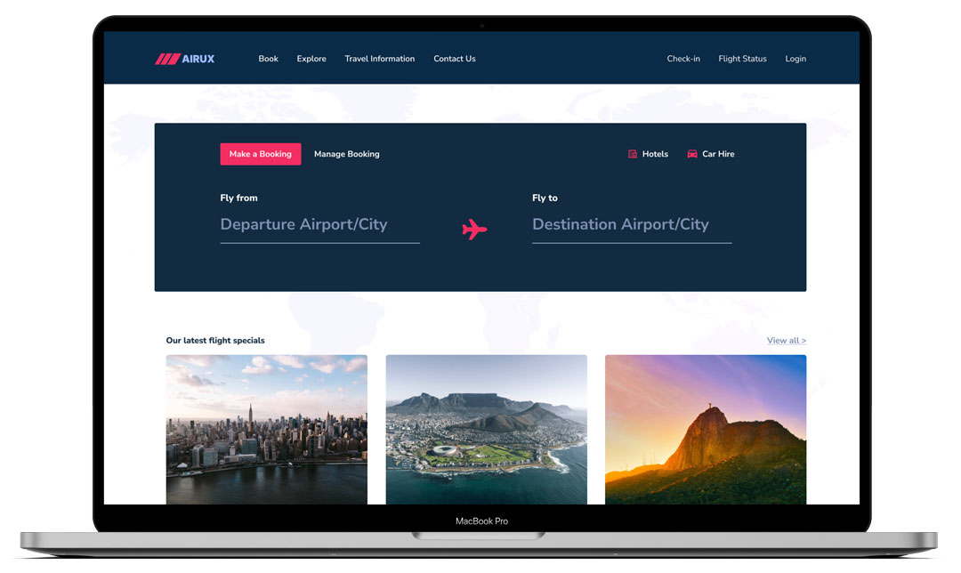
- Homepage – What the user is greeted with? How easy is it to start the search process.
- Search – How easy it is for the user to select their desired destination and return flight. How the calendar functions by selecting departure and return dates.
- Select – What process the user must go through in order to select flights. How the different fares are displayed and understood by the user.
- Payment – How does the user enter details and proceed with payment.
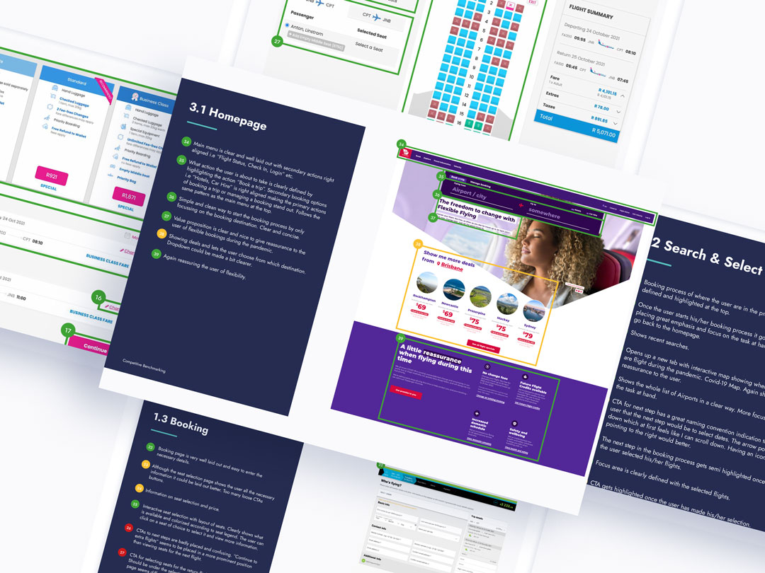
During this exercise a list of best-in-class airlines was chosen, locally and internationally as well as an aggregator website. Airlines selected kulula.com, safari.com, virginaustralia.com, and travelstart.com.
Key findings:
- User gets presented with a clear and concise search bar
- Clear structure in layout makes it easier for the user to reach their goal
- There is a huge benefit if the user can get through the steps quickly
- Display the most important information to the user at the right time of the booking process
Online Survey
A combination of structured and unstructured questions was used to gather quantitative and qualitative data to get a better understanding of the general behavior of users when going through the process of booking flights, their goals, and whether anything is preventing them from doing so.
Areas of focus:
Goals
- When was the last time you visited an airline website booking website or app?
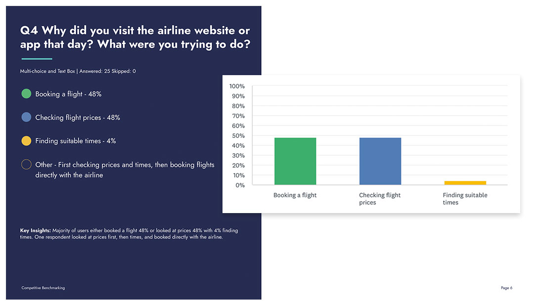
- Why did you visit the Airline/Booking website or app that day? What were you trying to do?
Behavior
- Were you able to complete your task that day? If not, tell us why?
- What would you change about the website/app? What improvements would you make?
- Did the airline website/app meet your expectations that day?
Context
- Which device did you use?
- Which airline booking website/app did you visit?
Learnings:
More than half of the respondents (68%) visited an Airline booking website or app in the 4 months. 16% of respondents haven’t visited an airline booking site in the last 12 months because of the pandemic. Suggestions of improvements varied but most respondents would like to see a better calendar view when selecting flights with a filter to showcase cheaper options first. Pricing is very important to the user. Most respondents weren’t sure about the added extras and felt it was confusing at times.
More than half of the respondents 55% went to look for flights on the airline website/app itself while 45% went to look on aggregator websites.
View Results
User Interview & Usability Testing
Three usability tests were conducted to gain rich insights directly from three users. These insights would become helpful in making design decisions later in the project to design a better product.
Objectives:
- To get a better understanding of the context of use of people that use the website.
- Learn about the goals and behaviors of customers when booking flights.
Key takeaways:
- Users get distracted by too many pop-ups and adverts
- Users like to stick to their goal without distractions
- Clean and simplistic design helps users to make decisions faster
- Flight information and where they are in the booking process should be clearly visible
Watch the Recording
Analysis
After gathering all the research data, it was time to analyze all the data to clearly articulate the problems I’m attempting to solve. Through using techniques such as Affinity Diagrams and Customer Journey Mapping I was truly able to understand the problem at hand.
Afinity Diagrams
This was an important step in organizing the raw data. It allowed me to sort through all the qualitative data and get to the root of my findings.
After reviewing the data, I made notes on post-its by only writing an observation per post-it. These observations were then organized into groups to better understand the user pain points in the booking process.

View Affinity Diagrams
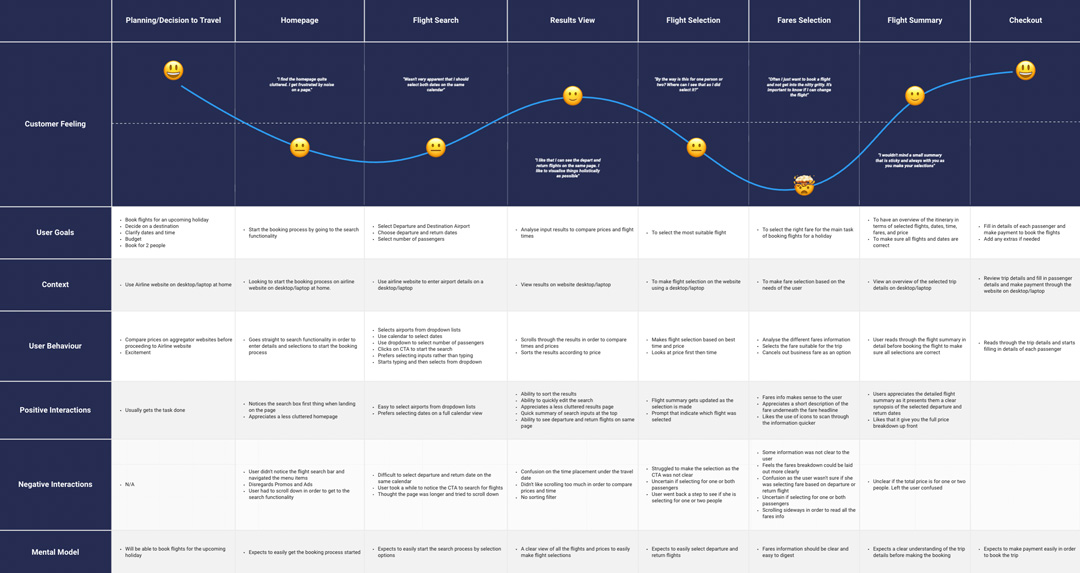
Customer Journey Mapping
I used the notes gathered from the high-level grouping in the Affinity Diagram and from the Usability Tests to assess the customers’ experience and provide a measurement based on their mood during the booking process.
The design models did not always match the mental models of the user and caused some friction during the booking process. Through creating a customer journey map, it was clear some improvements could be made to make the booking process easier for the user.
View Customer Journey Map
Design
After analyzing all the data from the research phase, it is time to look at the design and to fix the issues pick up from the analysis. Steps taken during the design phase: Flow Diagram, Interaction Design, Prototyping, and Annotations.
Flow Diagram
The first step in the design process was to know how the user will navigate through the booking process to achieve their goals in the simplest way. This also helped in visualizing where a screen sits in the site architecture and how a user will navigate to reach it.
In order to create the flow diagram I focussed on the issues highlighted in earlier stages and based it on the most common use case followed by an easier path.
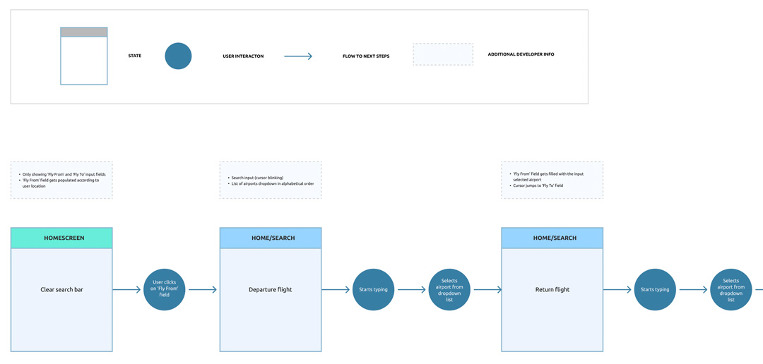
View Flow Diagram
Interaction Design
A lot of work has gone into understanding and articulating the problem at hand and it was now time to start solving the problem.
Following on from the user journey, and revisiting the customer journey map and affinity diagram I created sketches in the form of low-fidelity wireframes. This helped me to create a visual hierarchy of each page and address any pain points. A few iterations were made to these sketches to find a solution.
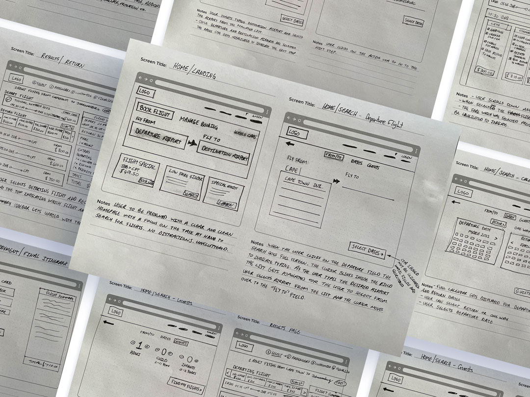
View Process Document
Wireframes & Prototyping
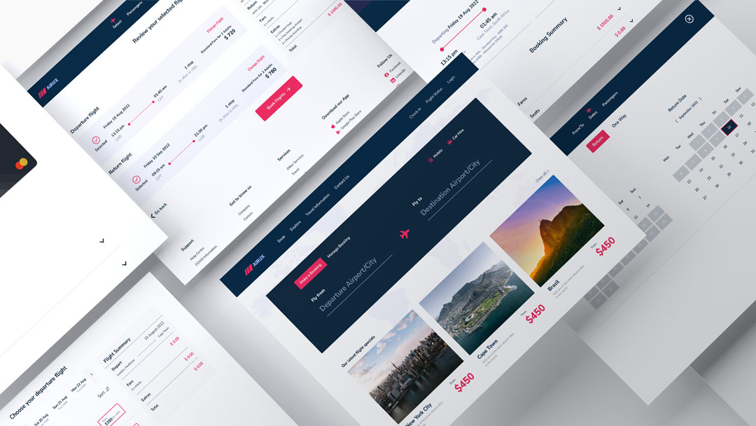
After sketching out the different screens I transferred them to digital format in Figma. Medium-fidelity prototypes were designed and refined to enhance the experience.
Usability testing was performed on the prototype and further iterations were made to the prototype.
Annotations
The last step in the UX Process was to break down each screen and component with detailed notes for the developers on how it should function. This would help the developers build a fully functional product.
Conclusion
UX Design is a problem-solving discipline with Research being the most important process. Without the appropriate research and analysis, it is hard to make the correct design decisions you can’t rely only on assumptions. Fully understanding the users’ pain points, mental models, goals, behaviors, and context of use are invaluable in the design process.
UX design never ends and is a continuous process to make a product better.