MojoReporter
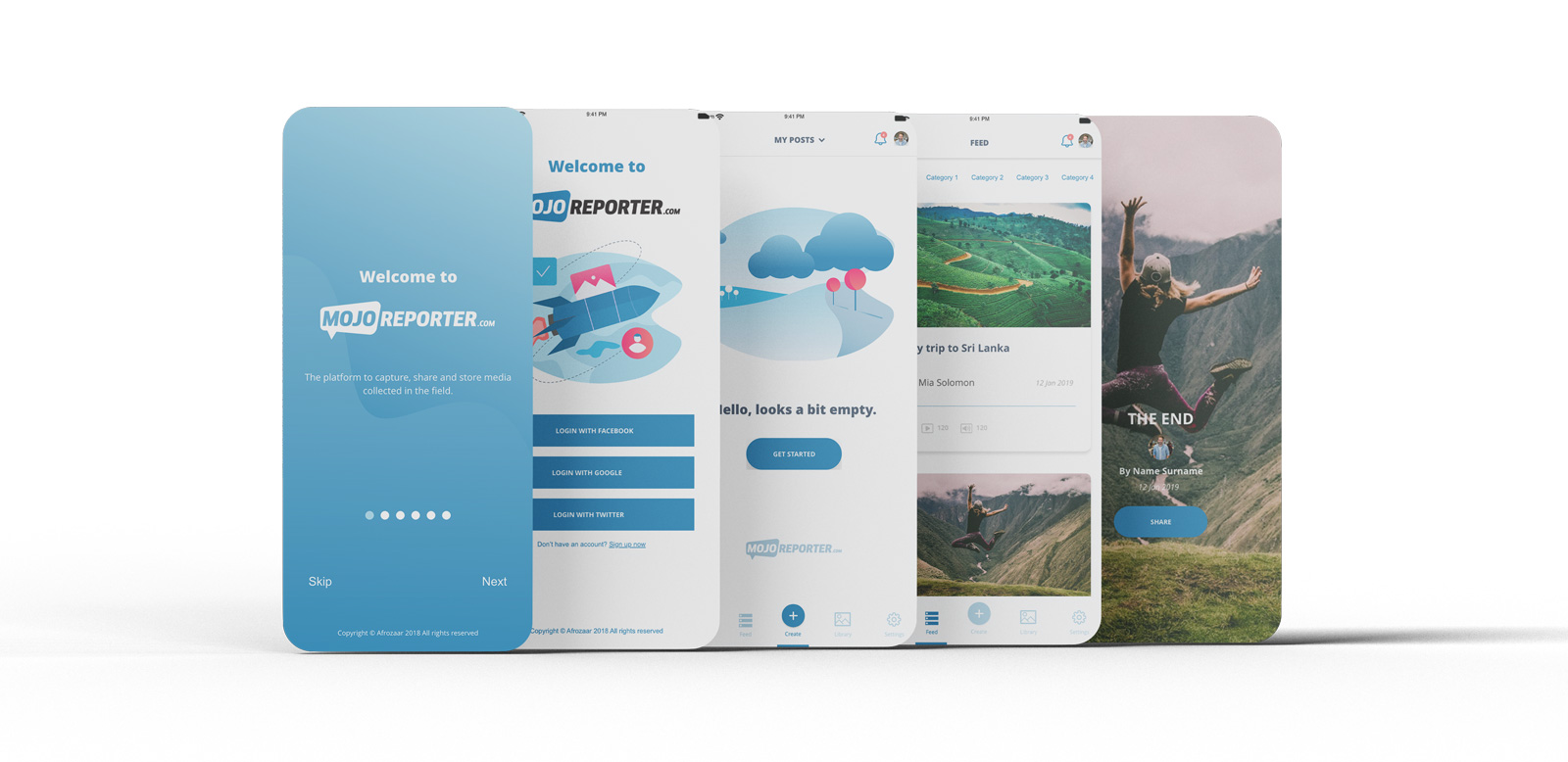
MojoReporter is a digital media ecosystem for the new mobile generation. MojoReporter lets the user capture and share mobile media in an easy and efficient way to empower the user on telling their story. I was asked to assist the MojoReporter team with improving the UX/UI of the mobile app.
ClientMojoReporterServicesUX Audit, UX/UIToolsAdobe XDYear2019/2020Linkwww.mojoreporter.com
Phase 1: UX Audit
MojoReporter was already a fully functional app. Before we could make any improvements to the UI an in-depth audit had to be done to make certain no steps are missed throughout the user journey. Sitting down with the relevant stakeholders we defined key areas and what the user should achieve at every step of the user journey.
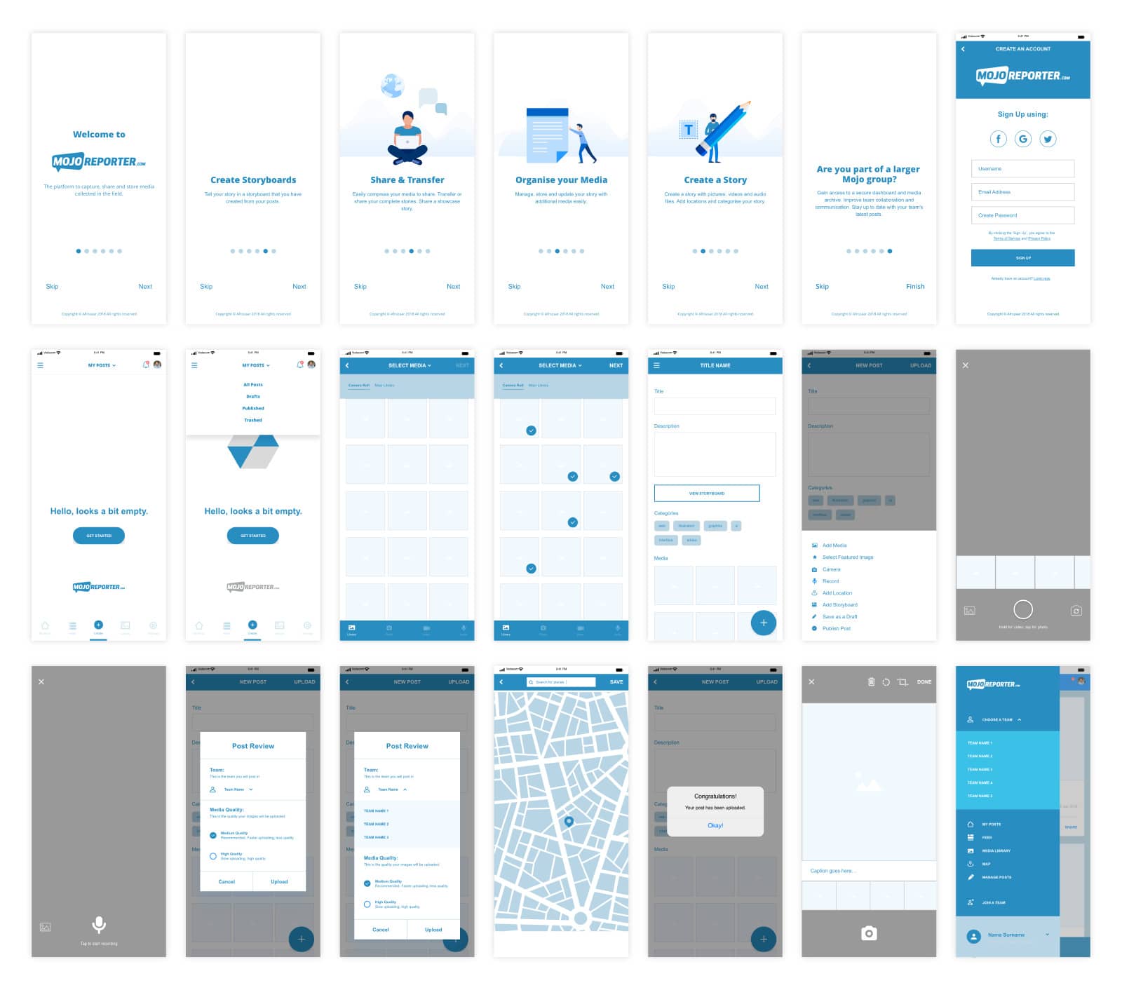
Phase 2: Wireframing
After conducting an UX audit and some testing around certain features it was time to start on low-fidelity wireframes to start the wireframing process. Once all the key features and functionality has been approved, we developed high-fidelity wireframes to make sure all design decisions are communicated correctly.
Phase 3: Prototyping
It was very important for us to develop a prototype of the high-fidelity wireframe before starting on the UI phase to show relevant stakeholders how the final product would function.
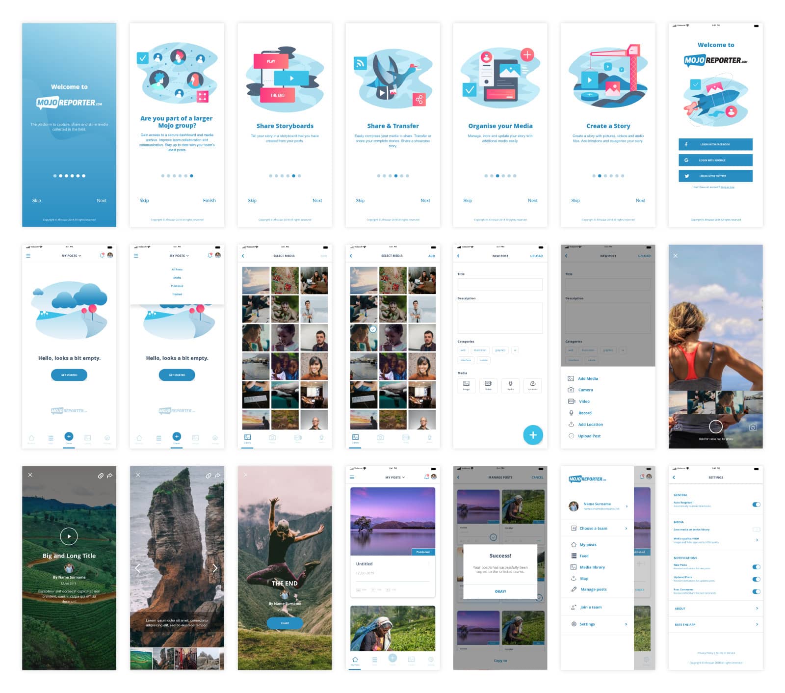
Phase 4: User Interface Design
Once the proposed functionality has been approved the UI Design phase kicked off with a focus to make the interface as intuitive as possible.


